Best Practices for Responsive Design in Hyva Theme Development
Much like a pen is not a pen without a good ink in the same way, an e-commerce storefront lacks completeness without a theme that is intuitive, attractive, user-friendly, and fast-loading which is an essential component of any website’s responsive design.
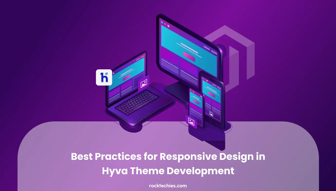
Responsive design stands as a cornerstone in web development, ensuring seamless user experiences across different devices. Within the approach of Hyva Theme development in Magento, adhering to responsive design best practices proves pivotal in meeting the multifaceted needs of contemporary online buyers.
Moreover, nowadays the Hyvä Theme, serving as the pinnacle frontend solution for Magento-2, and that’s why experiencing a surge in popularity within the market. Its primary objective lies in enhancing the performance of e-commerce platforms through the implementation of a sophisticated and streamlined technology stack to revamp the frontend. Plus, AlpineJS, Tailwind CSS, and HTML5 stand out as the key components of this innovative tech stack.
Now as the title suggests, this article delves into Hyvä themes for Magento 2 stores, which represent an advance and new approach to developing Magento storefronts. Stay tuned with us to read how Hyva themes boast lightning-fast speeds, seamless integration, and straightforward operation.
1. Priortize on Mobile-First Design:
Don’t’ forget to start Hyva Theme development with a mobile-first approach the reason behind this is by commencing design and development processes with mobile devices in mind, ensure that your user get excellent experience without any navigational or technical hindrances in smaller screens.
Such an approach establishes a foundation for responsive design that naturally scales up to larger devices, thus help in increasing the session, and reducing the bounce rate. Mobile-first design transcends mere size reduction, necessitating deliberate structuring of content hierarchy, navigation, and functionality to tailor experiences for mobile users. The Hyva Theme readily accommodates this ethos, ultimately facilitating developers in structuring designs with mobile responsiveness at the forefront.
2. Embrace Flexible Grids and Layouts:
Leverage flexible grids and layouts to craft a responsive framework adaptable to varying screen sizes. Hyva theme offers grid systems enabling developers to define layouts fluidly and responsively. Through percentage-based widths and flexible containers Hyva maintains seamless adjustment of designs to user device dimensions.
Also, the Hyva Theme’s grid system harnesses contemporary frontend technologies like Flexbox and CSS Grid, empowering developers with robust tools for crafting responsive and dynamic layouts which is indispensable for accommodating today’s diverse device landscape.
3. Implementation of Media Queries for Device Adaptation:
Employing media queries is a commonly used method to provide customized style sheets for various devices including desktops, laptops, tablets, as well as mobile phones like iPhones and Android devices.
If you have hired a Hyva theme developer that you can ask them to Incorporate media queries to apply tailored styles based on user device characteristics. Hyva Theme developers wield media queries to delineate breakpoints necessitating layout or styling adjustments for optimal user experiences.
Through usage of media queries, fine-tune font sizes, margins, and other stylistic elements you can enhance readability and usability across devices. Plus, the Hyva Theme’s modular and customizable framework seamlessly integrates media queries into overarching design strategies.
4. Streamline Image and Asset Optimization:
Statistics indicate that 70% of all data downloaded by web browsers consists of images. It’s crucial not to underestimate the significance of optimizing images to be faster, lighter, and more streamlined.
That’s why one of the other well-known practices for hyva theme development is streamlining image and asset optimization to expedite loading times on mobile, and other devices. Cumbersome images significantly impede page load speeds, compromising user experiences.
Hyva Theme development pushes for optimized images and lazy loading techniques, ensuring only essential assets load, thereby enhancing performance on mobile networks.
We recommend you to explore responsive image techniques such as the srcset attribute to deliver appropriately sized images based on user devices, mitigating load times and conserving bandwidth. Besides this it would be better to use some other tactics including smart image compression via Magento CDNs, switching to modern file format like AVIF, enabling progressive JPEG image format, and using vector images where possible.
5. Integration of Progressive Web App (PWA) Features:
It is advisable to make use of Magento PWA which amalgamates the finest elements from conventional websites and native mobile applications, delivering a remarkable user experience encompassing rapid loading, offline accessibility, less storage space, app like experience, and push notification capabilities. Crafted to operate across diverse devices, Magento 2 PWAs offer businesses a cost-effective means to enhance numerous Magento stores with advanced and unlimited features, however, it’s usage is not limited to this.
PWA features can be Integrated into the Hyva theme for enriched mobile experiences, and other functionlities. PWAs offer native app-like functionality encompassing less loading time to display the pages, comes with add to home screen capability, while simultaneously increasing the conversion rate.
Also, seamlessly supporting PWA features, the Hyva Theme empowers developers to craft immersive and responsive web applications irrespective of the industry and size of app, elevating the overall user experience akin to native app environments on mobile devices.
6. Optimization of Touch-Friendly Navigation:
A user-friendly e-commerce platform enhances visitor engagement, prolonging their stay. This extended duration enables visitors to delve deeper into your site, accessing the necessary information effortlessly. Clarity in your offerings is paramount; visitors should grasp your products/services without excessive scrolling or clicking which is not possible without having a structural navigational structure of your site.
If potential customer encounter navigation challenges, they may opt to abandon your site in favor of a more user-friendly alternative. That’s why it is important to optimize navigation for various devices by incorporating touch-friendly design elements.
Within the Hyva Theme, developers customize navigation menus and buttons to facilitate seamless interaction. Plus emphazing large, tappable areas while minimizing the necessity for pinch-zooming, fostering an intuitive and user-friendly mobile experience.
Moreover, thoughtfully positioning essential navigation elements and calls-to-action to bolster accessibility and help users explore the store; some of the navigational strategies for Hyva theme development encompass using a customized search bar, drop-down menus with subcategories, footer menu, and breadcrumb navigation.
7. Rigorous Cross-Browser Testing:
Cross-browser testing is integral to Magento 2 hyva theme development, ensuring smooth functionality across various browsers, screen sizes, devices, and operating systems. Its purpose is to identify and rectify compatibility issues or errors that may arise when users access the website through different browsers.
So you have to conduct a rigorous cross-browser testing to ensure consistent responsiveness across diverse browsers and devices. While Hyva theme development transcends browser limitations, striving for a universally positive user experience, thorough testing across popular browsers and devices aids in identifying and rectifying compatibility issues, maintaining a cohesive look and feel.
To make sure that the your Magento site comes out cross browser compatible you can check for the doctype, apply CSS reset, use separate stylesheet for different browsers, and Use Cross Browser Friendly Libraries and Frameworks.
Conclusion:
Responsive design within Hyva Theme development transcends mere aesthetic appeal, striving to deliver tailored and gratifying user experiences irrespective of device access. Through the adoption of a mobile-first approach, utilization of flexible grids and layouts, implementation of media queries, optimization of images, integration of PWA features, optimization of touch-friendly navigation, and comprehensive cross-browser testing, optimal responsiveness within the Hyva Theme is attainable.
As user device preferences diversify, responsive design emerges as a linchpin for e-commerce platform success. The Hyva Theme’s modern architecture and emphasis on adaptability empower developers, and online retail merchants to seamlessly implement these best practices, ensuring online experiences captivate and engage users across all device spectra.